问题
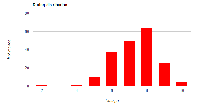
I've been trying to show all labels on the horizonal axis of my chart, but I haven't been able to do that!
I tried using hAxis.showTextEvery=1 but does not work
(see https://developers.google.com/chart/interactive/docs/gallery/columnchart).

Basically, I would like to also show numbers "5", "7" and "9" that are currently missing in the above chart.
Here the JavaScript code, thanks a lot.
<script type="text/javascript">
 google.setOnLoadCallback(drawChart1);
 function drawChart1(){
     var data = new google.visualization.DataTable(
     {
        "cols":[
            {"id":"","label":"ratings","type":"number"},
            {"id":"","label":"# of movies","type":"number"}],
            "rows":[
                {"c":[{"v":9},{"v":26}]},
                {"c":[{"v":8},{"v":64}]},
                {"c":[{"v":10},{"v":5}]},
                {"c":[{"v":7},{"v":50}]},
                {"c":[{"v":6},{"v":38}]},
                {"c":[{"v":5},{"v":10}]},
                {"c":[{"v":2},{"v":1}]},
                {"c":[{"v":4},{"v":1}]}
            ]});

     var options = {
        "title":"Rating distribution",
        "vAxis":{"title":"# of movies","minValue":0},
        "hAxis":{"title":"Ratings","maxValue":10},"legend":"none","is3D":true,"width":800,"height":400,"colors":["red"]
     };
     var chart = new google.visualization.ColumnChart(document.getElementById('chart_movies_per_rating'));chart.draw(data, options);
 }
 </script>
UPDATE: this is the solution I developed, following the answer below (thanks again!). http://jsfiddle.net/mdt86/x8dafm9u/104/
<script type="text/javascript">
google.setOnLoadCallback(drawChart1);
function drawChart1(){
var data = new google.visualization.DataTable(
     {"cols":
        [{"id":"","label":"ratings","type":"string"},
        {"id":"","label":"# of movies","type":"number"}],
             "rows":
             [{"c":[{"v":"0"},{"v":0}]},
             {"c":[{"v":" 1"},{"v":0}]},
             {"c":[{"v":" 2"},{"v":1}]},
             {"c":[{"v":" 3"},{"v":0}]},
             {"c":[{"v":" 4"},{"v":1}]},
             {"c":[{"v":" 5"},{"v":10}]},
             {"c":[{"v":" 6"},{"v":38}]},
             {"c":[{"v":" 7"},{"v":50}]},
             {"c":[{"v":" 8"},{"v":64}]},
             {"c":[{"v":" 9"},{"v":26}]},
             {"c":[{"v":" 10"},{"v":5}]}
             ]
        }
 );

 var options =
    {"title":"Rating distribution",
    "vAxis":{"title":"# of movies","minValue":0},
    "hAxis":{"title":"Ratings","maxValue":10},
    "legend":"none",
    "is3D":true,
    "width":800,
    "height":400,
    "colors":["CC0000"]};
    var chart = new google.visualization.ColumnChart(document.getElementById('chart_movies_per_rating'));
    chart.draw(data, options);
 }
    </script>
回答1:
Your problem is related to the continuous versus discrete subtleties in ColumnChart. Basically, you have continuous values for labels on your hAxis, and the showTextEvery only works for discrete ones. To fix this, I would do the following:
- Have all your missing ratings inserted into the chart (ie, if there are no values at rating '3', insert a zero).
- Order the ratings in the chart. (Google charts could sort this for you, but it's likely easier to just order them.)
- Change the ratings to
{"id":"","label":"ratings","type":"string"}, - Use the showTextEvery:1 in the options
Below is some code that demonstrates this:
var data = new google.visualization.DataTable(
{
  "cols":[
    {"id":"","label":"ratings","type":"string"},
    {"id":"","label":"# of movies","type":"number"}],
  "rows":[
    {"c":[{"v":'10'},{"v":5}]},
    {"c":[{"v":'9'}, {"v":26}]},
    {"c":[{"v":'8'}, {"v":64}]},
    {"c":[{"v":'7'}, {"v":50}]},
    {"c":[{"v":'6'}, {"v":38}]},
    {"c":[{"v":'5'}, {"v":10}]},
    {"c":[{"v":'4'}, {"v":1}]},
    {"c":[{"v":'3'}, {"v":0}]},
    {"c":[{"v":'2'}, {"v":1}]},
    {"c":[{"v":'1'}, {"v":0}]},
  ]});

var options = {
  "title":"Rating distribution",
  "vAxis":{"title":"# of movies","minValue":0},
  "hAxis":{"title":"Ratings",showTextEvery:1},
  "legend":"none",
  "width":800,"height":400,"colors":["red"]
};
回答2:
In addition to Jeremy's solution, another approach is to keep using continuous values on the hAxis, but specify the number of gridlines you want, which should be the same as the number of labels you want. If you want 10 labels, 1 through 10, this should work:
hAxis: { gridlines: { count: 10 } }
来源:https://stackoverflow.com/questions/17742651/column-chart-how-to-show-all-labels-on-horizontal-axis