Setting overflow: scroll on a table with display: flex

I have a table with the display: flex property, whose cells will be centered vertically. When there are more cells than the table can show, the overflow:
-
According to the HTML spec, browsers must wrap the
<tr>elements inside a<tbody>element if there isn't any:
The height of that
<tbody>will be the height of all rows. However, the height of the<table>can be smaller. That wouldn't be a problem in a table layout, because the height of the table would be treated as a minimum height.However, the
<table>now participates in a flex layout, not a table layout. Since the<tbody>is atable-row-groupelement whose parent is neither atablenorinline-table(it's aflex), an anonymoustableparent is generated.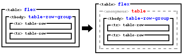
So now we have a
<table>which is a flex container with a single flex line, and which contains a single flex item (the anonymoustable).The height of the flex line will be the height of the flex container (spec):
If the flex container is single-line and has a definite cross size, the cross size of the flex line is the flex container’s inner cross size.
And then you use
align-items: center. That will align vertically the anonymoustable(together with the<tbody>) at the middle of the flex line, even if it overflows above or below.The problem is that scrollbars allow scrolling to see the content that overflows below, but not the content that overflows above.
Therefore, instead of
align-items: center, I suggest aligning with auto margins:Prior to alignment via justify-content and align-self, any positive free space is distributed to auto margins in that dimension.
Note the difference: auto margins only distribute positive free space, not negative one.
Therefore, we only have to style the flex item with
margin: auto 0; /* Push to the center (vertically) */But there is a problem: as explained above, the flex item is an anonymous generated element, so we can't select it with CSS selectors.
To solve that, we can add
display: blockto the<tbody>. Then, it won't be wrapped in any anonymoustableelement, so it will be a flex item and the alignment will work.Note this won't break the table, because the bunch of
<tr>s, which aretable-rows, will generate an anonymoustableparent, but now inside the<tbody>: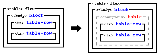
So you can use this code:
tbody {
  display: block; /* Disable tabular layout, and make <tbody> a flex item */
  margin: auto 0; /* Push to the center (vertically) */
}
#container { height: 180px; display: flex; flex-flow: row; align-items: stretch; border: 1px dashed gray; } table { display: flex; flex-flow: row; margin: 10px; overflow: scroll; border: 1px dashed blue; } tbody { display: block; /* Disable tabular layout, and make <tbody> a flex item */ margin: auto 0; /* Push to the center (vertically) */ } td { height: 10px; width: 100px; border: 1px solid red; } #container div { flex: 1; margin: 10px; border: 1px dashed red; }<div id="container"> <table> <tbody> <tr><td>A</td></tr> <tr><td>B</td></tr> <tr><td>C</td></tr> <tr><td>D</td></tr> <tr><td>E</td></tr> <tr><td>F</td></tr> <tr><td>G</td></tr> <tr><td>H</td></tr> <tr><td>I</td></tr> <tr><td>J</td></tr> <tr><td>K</td></tr> <tr><td>L</td></tr> <tr><td>M</td></tr> <tr><td>N</td></tr> <tr><td>O</td></tr> <tr><td>P</td></tr> <tr><td>Q</td></tr> <tr><td>R</td></tr> <tr><td>S</td></tr> <tr><td>T</td></tr> <tr><td>U</td></tr> <tr><td>V</td></tr> <tr><td>W</td></tr> <tr><td>X</td></tr> <tr><td>Y</td></tr> <tr><td>Z</td></tr> </tbody> </table> <table> <tbody> <tr><td>A</td></tr> <tr><td>B</td></tr> <tr><td>C</td></tr> </tbody> </table> <div></div> </div>讨论(0) -
Please visit - https://jsfiddle.net/3y80zqzc/1/
You will observe newly added class for
tbody. margin parameter is most important which ensures vertically middle position for the content.margin: auto, 0; /*this is for vertically middle position*/ margin: 0, auto; /*this is for horizontally center position*/You may also look at the HTML code
<html lang="en" xmlns="http://www.w3.org/1999/xhtml" xml:lang="en"> <head> <meta content="text/html; charset=UTF-8" http-equiv="content-type"> <style> #container { height: 180px; display: flex; flex-flow: row; align-items: stretch; border: 1px dashed gray; } table { display: flex; flex-flow: row; align-items: center; margin: 10px; overflow: scroll; border: 1px dashed blue; } td { height: 10px; width: 100px; border: 1px solid red; } #container div { flex: 1; margin: 10px; border: 1px dashed red; } tbody { display: block; margin: auto 0; } </style> </head> <body> <div id="container"> <table> <tr><td>A</td></tr> <tr><td>B</td></tr> <tr><td>C</td></tr> <tr><td>D</td></tr> <tr><td>E</td></tr> <tr><td>F</td></tr> <tr><td>G</td></tr> <tr><td>H</td></tr> <tr><td>I</td></tr> <tr><td>J</td></tr> <tr><td>K</td></tr> <tr><td>L</td></tr> <tr><td>M</td></tr> <tr><td>N</td></tr> <tr><td>O</td></tr> <tr><td>P</td></tr> <tr><td>Q</td></tr> <tr><td>R</td></tr> <tr><td>S</td></tr> <tr><td>T</td></tr> <tr><td>U</td></tr> <tr><td>V</td></tr> <tr><td>W</td></tr> <tr><td>X</td></tr> <tr><td>Y</td></tr> <tr><td>Z</td></tr> </table> <table> <tr><td>A</td></tr> <tr><td>B</td></tr> <tr><td>C</td></tr> </table> <div></div> </div> </body> </html>讨论(0)

 加载中...

- 热议问题