Tint image using CSS without overlay
Is it possible to tint an image with a specific color using CSS without an overlay in a WebKit browser?
Failed attempts
- Managed to tin
-
This is possible using an SVG filter today without having to use shaders. You can use this as a CSS filter (although it won't work in IE) through the -webkit-filter: "url(#yourfilterID)" etc. syntax.
<svg width="800px" height="600px" viewbox="0 0 800 600">
    <defs>
        <filter id="f1" x="0%" y="0%" width="100%" height="100%" color-interpolation-filters="sRGB">
        <feColorMatrix id="tinter" type="matrix" values=".6 .6 .6 0 0
                                                            .2 .2 .2 0 0
                                                            .0 .0 .0 0 0
                                                             0    0   0 1 0"/>
        </filter>
    </defs>

 <image x="0" y="0" width="550" height="370" preserveAspectRatio="true"
    filter="url(#tinter)" xlink:href="http://www.crossfitwaxahachie.com/wp-content/uploads/2012/04/IMG_0752.jpg"/>
</svg>
Dynamic demo at http://codepen.io/mullany/details/baLkH/
讨论(0) -
box-shadow: inset 0px 0px 64px 64px cornflowerblue, 0px 0px 4px 4px cornflowerblue;A tint in any color (rather than sepia or rotation filters which aren't supported everywhere) could be achieved by an inset box-shadow, in the appropriate size.
讨论(0) -
How about an underlay then?
HTML:
<span class="tint"><img src="..." /></span>CSS:
.tint { background-color:red; display:inline-block; }
.tint img { opacity:0.8 }
Tweak the color and opacity as you wish. Doesn't really work on images with transparency in them.
讨论(0) -
While there are no stand alone tint filter you can make kind of one by composition of existing filters without shading.
Combine sepia to unify the color, then hue-rotate to the color you want it to be tinted with
-webkit-filter: sepia(90%) hue-rotate(90deg);I use borders with an alpha value for my tints, its really an overlay but doesn't use any extra DOM elements making the transition to sepia+hue-rotate simpler when the other browsers get those filters.
讨论(0) -
Eventually it will be, using shaders. See the W3C Docs on Filters.
At the moment, what is possible for instance is:
-webkit-filter: grayscale; /*sepia, hue-rotate, invert....*/
-webkit-filter: brightness(50%);
See
- David Walsh on CSS Filters
- Stackoverflow: apply a rose tint...:
- W3C Filter Effects 1.0 Docs - 38.2.5. Other uniform variables: the CSS shaders parameters
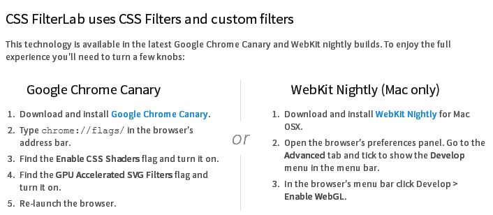
Update:
Adobe released its HTML5 based CSS Filter Labs with support for custom filters (Shaders) on supported browsers:
 讨论(0)
讨论(0)

 加载中...

- 热议问题